September 19, 2026
September 19, 2026
How Global Payroll and EOR Platforms Compete in AI Search: Leaders, Gaps and Buyer Intent
Deel and Remote account for a combined 33.0% Share of Voice in Era’s global payroll and EOR report. But provider gaps, early placements for less-visible brands and frequently cited comparison pages reveal a more fragmented competitive landscape.
Deel and Remote account for a combined 33.0% Share of Voice in Era’s global payroll and EOR report. But provider gaps, early placements for less-visible brands and frequently cited comparison pages reveal a more fragmented competitive landscape.
For a payroll or employer of record platform, appearing in an AI-generated shortlist can put the brand into a buyer’s evaluation before a sales conversation begins. The useful question is where that appearance happens: a startup payroll search, a multinational consolidation project or a comparison of overseas hiring options. Era’s report examines brand visibility, Share of Voice, answer position, provider differences, search queries and citation sources. Those measures describe different parts of the buying journey. A company can capture substantial attention, appear early in a narrow set of answers or remain absent from an entire engine.
A payroll platform can appear early when it is mentioned and still be absent from most monitored answers.
That distinction runs through Era’s global payroll and EOR report. The attention leaders differ from the displayed podium; several brands have sharply uneven coverage across engines; and comparison pages compete with vendor websites as sources. For marketing teams, the opportunity is to identify which buying questions and evidence sources deserve attention.
1. Attention — The podium and Share of Voice tell different stories
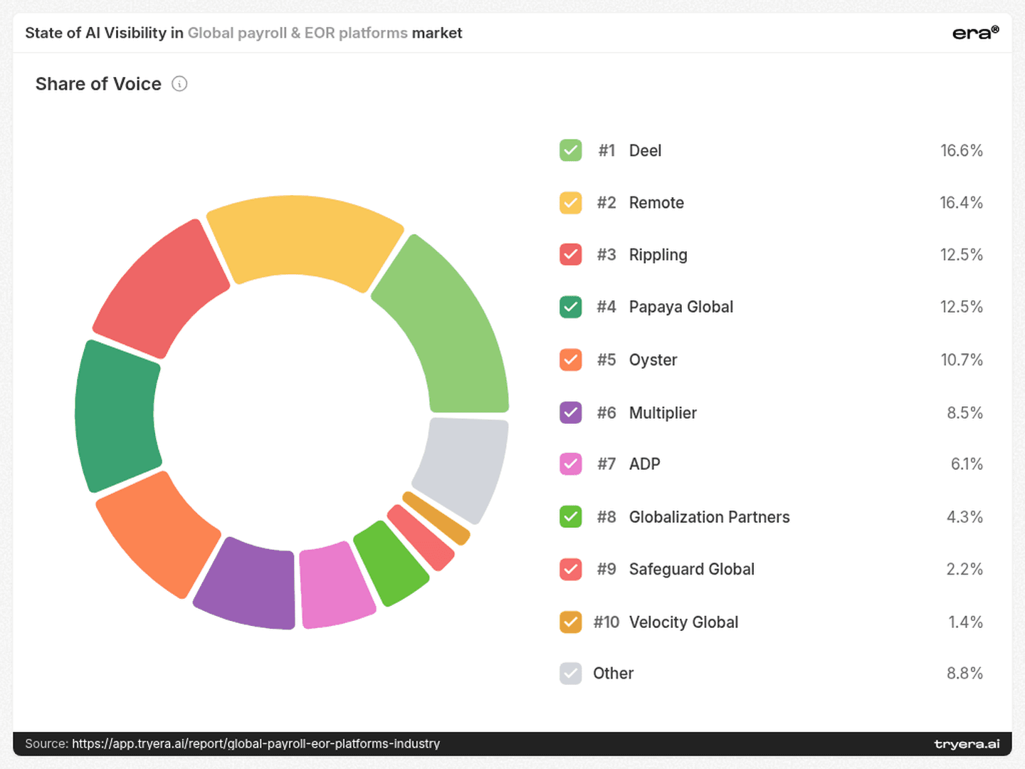
Deel has 16.6% Share of Voice and Remote has 16.4%, a gap of just 0.2 percentage points. Together, they account for 33.0% of the report’s Share of Voice. Rippling and Papaya Global each have 12.5%, followed by Oyster at 10.7%.
Share of Voice measures a brand’s mentions relative to mentions of all tracked brands. It describes competitive attention, rather than the percentage of answers in which a company appears.
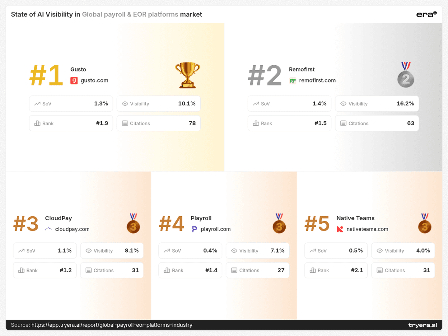
The official podium displays Gusto first, followed by Remofirst, CloudPay, Playroll and Native Teams. Gusto’s card shows 10.1% Visibility and 1.3% Share of Voice; Remofirst’s shows 16.2% and 1.4%, respectively. The podium therefore should not be read as a descending ranking of either metric.
For a category dashboard, keep three questions separate: how frequently does the brand appear, how much competitive attention does it capture, and where does it appear within an answer? A single “AI leader” label hides those distinctions.
A useful competitive target specifies the metric, the engine and the buying question.
2. Coverage — The same brand has different competitors across engines
Remofirst’s report-wide Visibility reaches 27.1% on Google AI, compared with 2.0% on ChatGPT: a 25.1-point gap. Its Perplexity result is 22.0%, while Claude is 14.0%.
Playroll shows 16.0% on Claude and 12.0% on Perplexity, with 0.0% on ChatGPT and Google AI in the monitored sample. TopSource shows 14.0% on Claude, 10.4% on Google AI, 4.0% on Perplexity and 0.0% on ChatGPT.
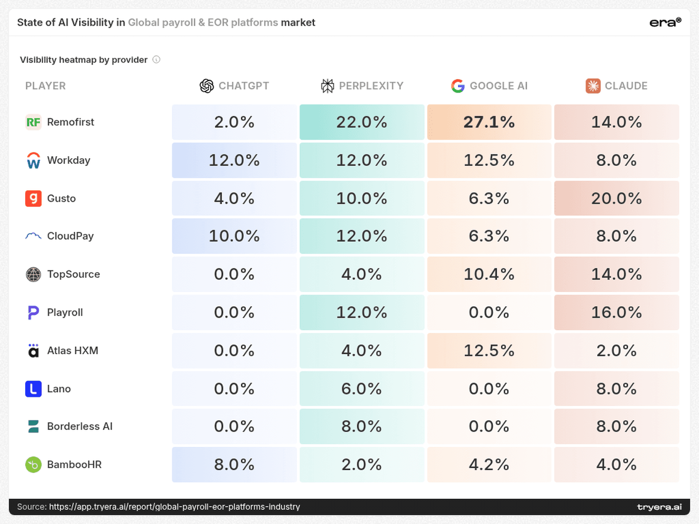
These patterns change the competitive comparison. CloudPay’s 10.0% ChatGPT Visibility exceeds Remofirst’s 2.0%, while Remofirst is ahead on Google AI, 27.1% to 6.3%. An overall comparison conceals that reversal.
The immediate research task is to run the same relevant buying questions across engines and inspect the resulting answers and citations. That can distinguish a recurring coverage gap from a prompt-specific omission. The heatmap identifies where to investigate; it does not establish why the difference exists.
3. Placement — Lano’s limited reach comes with an early average position
Lano records 3.5% Visibility and an average Rank of 1.1. Workday reaches 11.1% Visibility, with an average Rank of 1.5. Borderless AI records 4.0% Visibility and Rank 1.4; Atlas HXM has 4.5% and Rank 1.4.
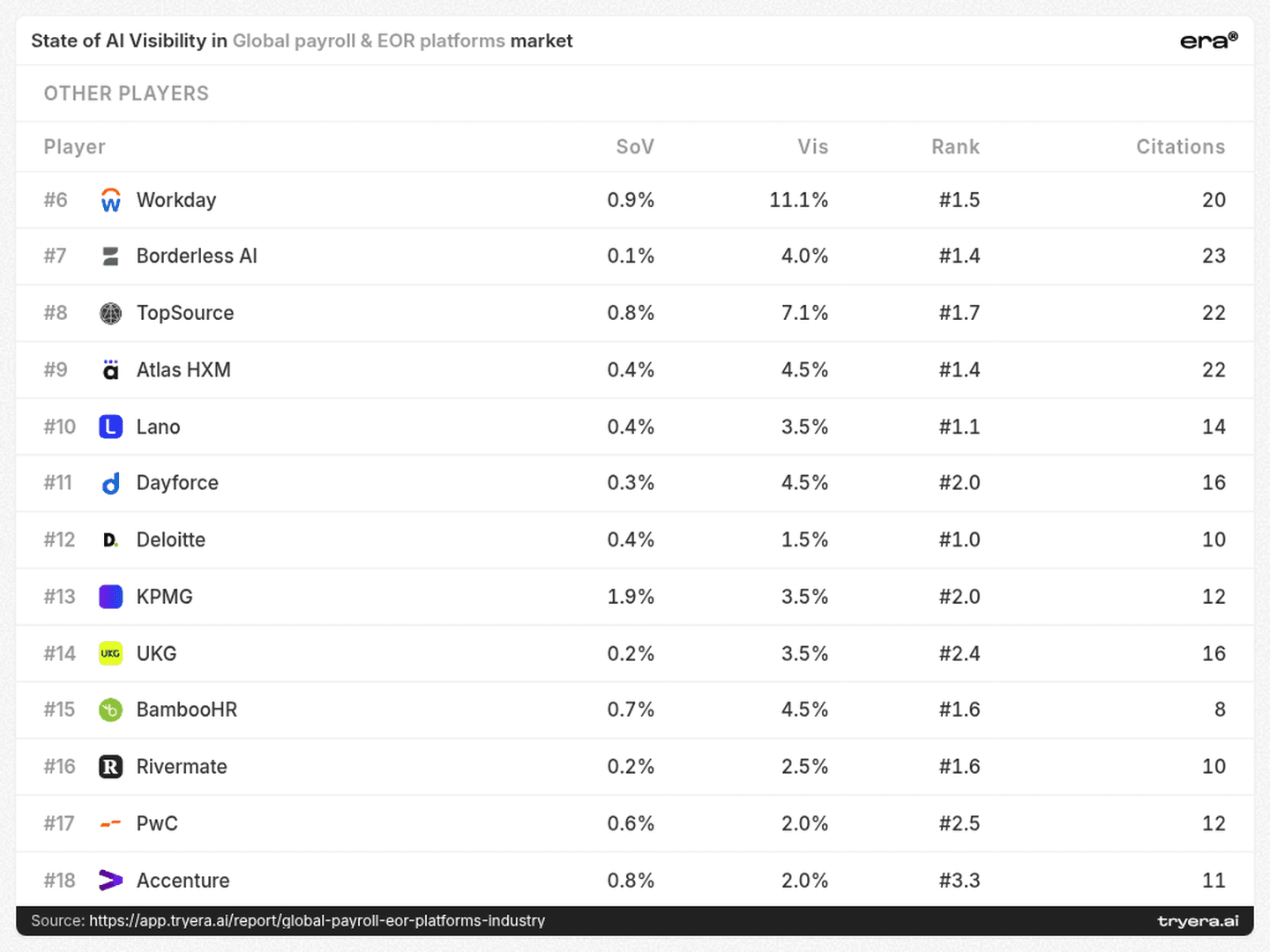
For Lano, the useful signal is early placement in the answers where it appears, alongside limited overall reach. That suggests a specific investigation: identify those answers, determine which needs they address, and test adjacent buying questions.
Borderless AI and Atlas HXM merit the same kind of review. Their inclusion should not be judged solely against the brands with the largest mention shares. An early position in a relevant evaluation can be commercially interesting even when broad coverage is low.
Limited reach and weak placement are different problems. They need different tests.
4. Intent — “Global payroll” contains several distinct buying jobs
The report associates brands with markedly different top queries:
Gusto: “best global payroll platforms startups 2026”
Workday: “enterprise global payroll providers multinational companies 2026”
TopSource: “top international payroll services mid-sized companies 2026”
Lano: “cross-border payroll compliant affordable provider”
Remofirst and Playroll: “EOR providers multi-country hiring comparison 2026”
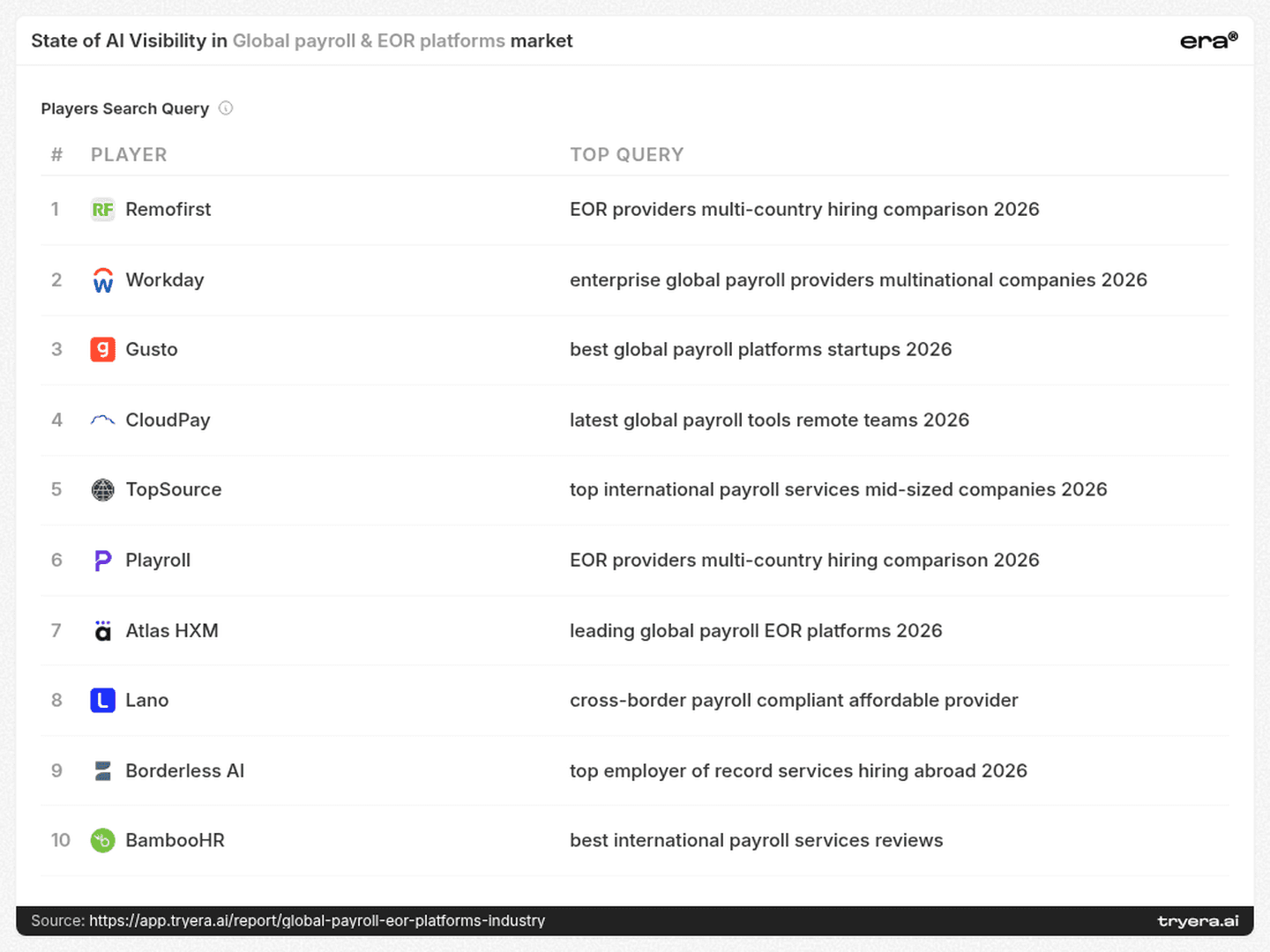
These associations suggest separate research tracks: startup suitability, multinational payroll operations, mid-sized company requirements, affordability and compliance, and multi-country hiring comparisons.
For TopSource, the mid-sized-company query offers a concrete place to investigate relevance. For Lano, the affordability-and-compliance wording suggests testing whether public evidence answers both parts of that request. For Remofirst and Playroll, the shared query offers a useful matched comparison.
The provider percentages above describe the report overall, not performance on these individual queries. Test each query separately before deciding which engine or competitor leads within that intent.
Content briefs should follow the buying job. A multinational comparison might need evidence about consolidation and integrations; an affordability query might need a clear explanation of fees and service scope. These are proposed tests, guided by the query language.
5. Sources — A cited comparison page can matter more than a publisher’s overall rank
The source list includes 99 citations for remote.com, 87 for peoplemanagingpeople.com, 74 for deel.com and 68 for g2.com. Vendor domains and editorial or review platforms all participate in the source landscape.
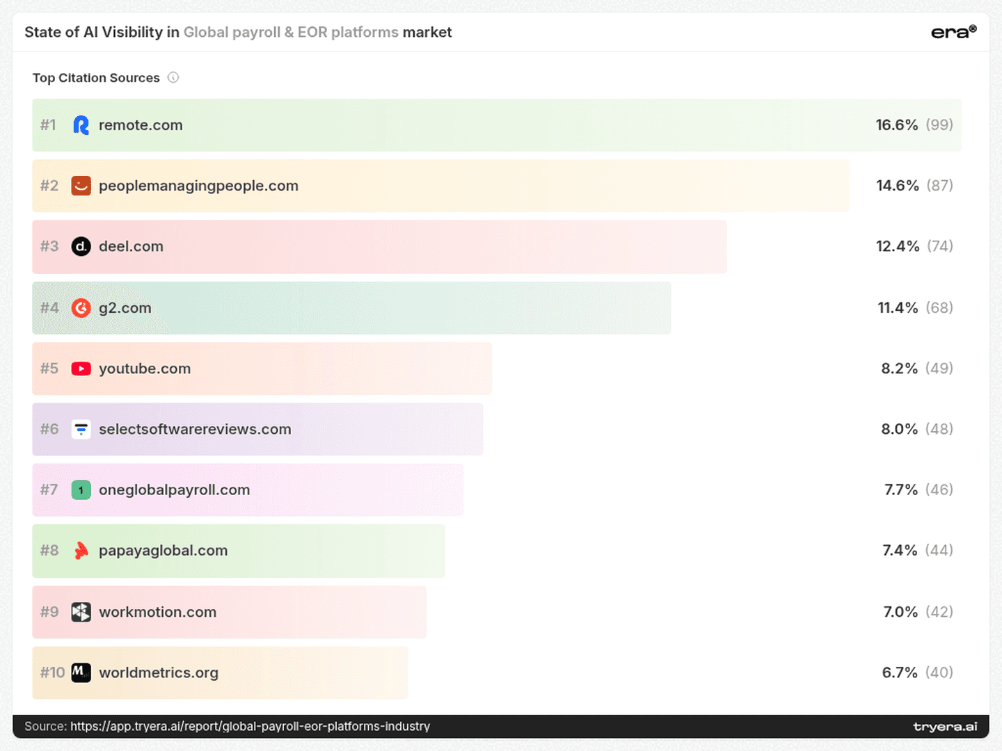
The individual-page view changes the order. The displayed SelectSoftware Reviews global-payroll comparison has 47 citations. People Managing People’s “10 Best Global Payroll Services for 2026” has 35. WorkMotion’s displayed global-payroll comparison has 34, ahead of Forbes’ “10 Best International Payroll Services Of 2026” at 28.
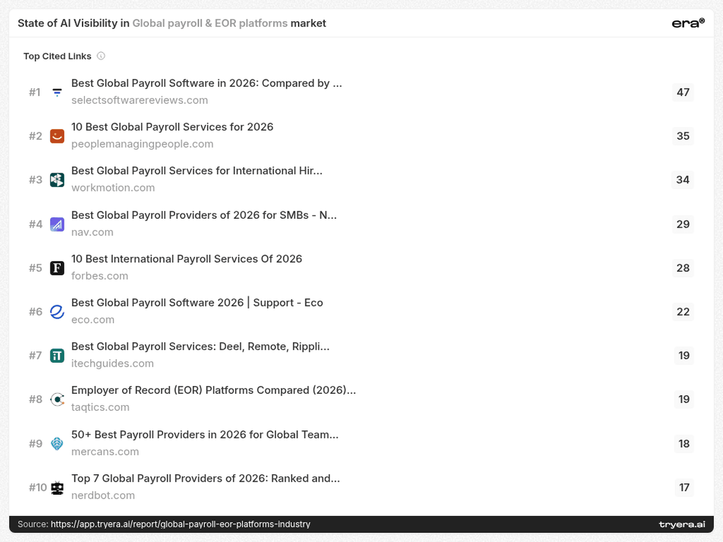
This creates two practical priorities. First, examine the specific comparison pages buyers’ AI answers cite, rather than prioritizing publishers solely by name recognition. Second, distinguish editorial comparisons from vendor-authored material. WorkMotion’s presence shows that a provider’s comparison content can also appear among the cited pages.
For a payroll brand, the review should ask whether its service scope, pricing conditions and target customer are represented accurately, and whether cited comparisons use current, verifiable evidence. A citation establishes use as a source; it does not establish neutrality or endorsement.
6. Evidence — Owned pages account for only part of the citation mix
Playroll’s citation mix is 19.0% own domain, 4.5% social and 76.5% others. TopSource’s is 18.1%, 6.8% and 75.1%. Workday’s is 6.1%, 4.5% and 89.4%.
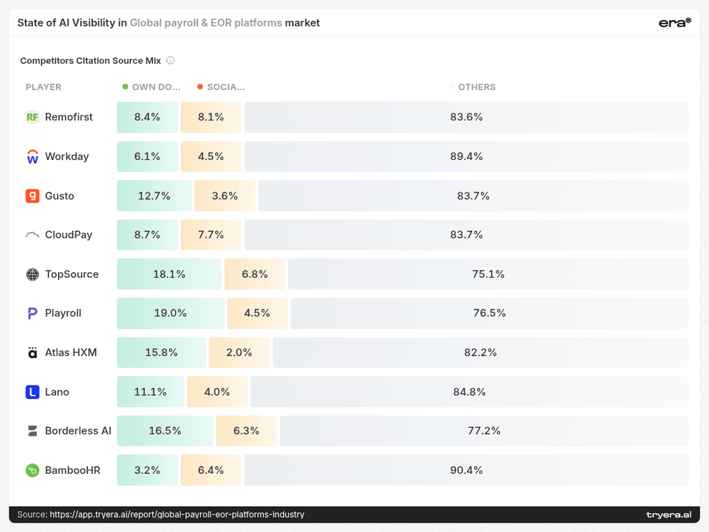
The “others” category dominates every displayed row. It should not be equated with independent endorsement: a source outside a brand’s own domain may still be another vendor’s content.
That makes website improvements one part of the work. Teams should also inspect how their offer is described in reviews, comparisons and other cited sources. Keep a record of authorship, factual accuracy, publication dates and the claims each source supports.
The goal is a consistent, verifiable account of the product across the sources buyers encounter.
7. Technical priorities — Use the audit as a work queue
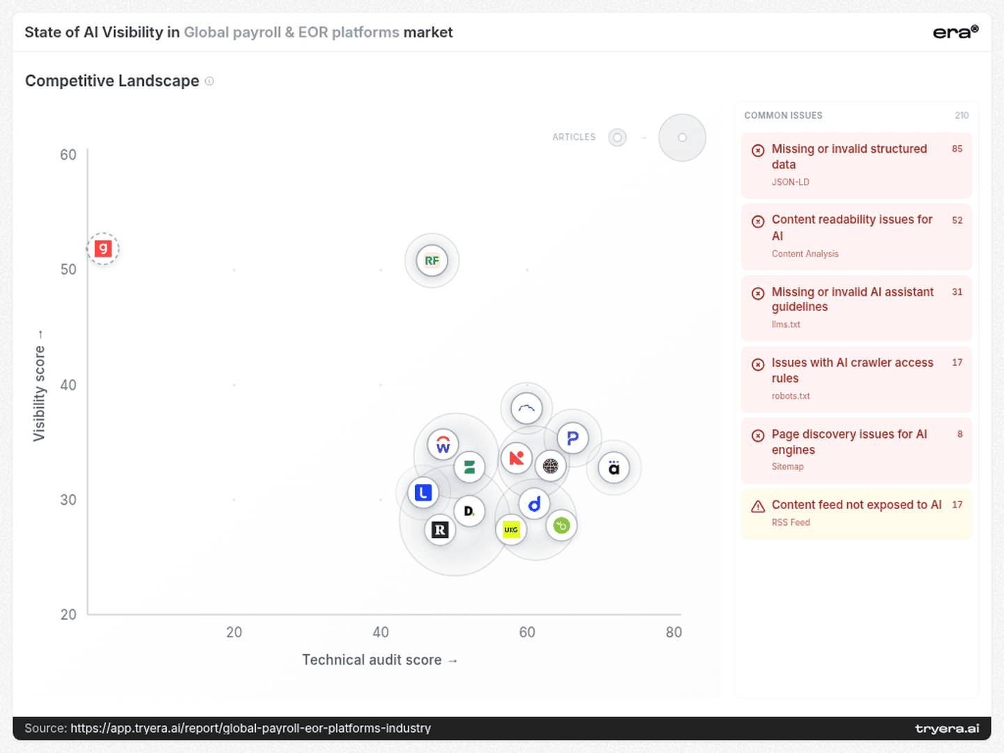
The competitive-landscape page lists 210 common issues. The largest groups are 85 missing or invalid structured-data issues and 52 content-readability issues, followed by 31 AI-assistant-guideline issues, 17 crawler-access issues, 8 discovery issues and 17 content-feed issues.
Start by validating relevant findings on the pages that serve the chosen buying questions. Check that intended crawlers can access them, that meaningful content is available, that structured data matches visible content, and that important pages can be discovered.
These are aggregate issue counts, not company-specific diagnoses. The landscape’s Visibility score is also a different measure from headline Visibility percentages. Use the audit to define and verify fixes; measure answer coverage separately to assess what changes.
8. The next 90 days — Build an intent-by-engine evidence program
Days 1–30: establish the comparison set. Select the buying jobs the product actually serves. Use the report’s startup, multinational, mid-sized-company, affordability and multi-country-hiring queries as starting points. Run matched questions across ChatGPT, Perplexity, Google AI and Claude. Record brand presence, position, cited pages and the reason each recommendation gives.
For a brand with Lano’s pattern, isolate the questions where early placement already occurs. For a brand with Playroll’s pattern, compare answers from engines showing presence with those showing no presence.
Days 31–60: address specific evidence gaps. Review the cited comparison pages and the product pages supporting each selected intent. Correct inaccurate owned descriptions and prepare documented corrections for external sources where needed. Make fees, service boundaries and relevant operational capabilities easy to verify. Validate technical findings on those same pages before expanding the work.
Days 61–90: repeat and compare. Rerun the matched question set. Compare changes in Visibility, position and citations within each engine and intent cohort. Keep a change log so that gains, losses and unchanged results remain interpretable. Expand a content approach only when repeated observations justify further testing.
A useful outcome is a clearer view of which buying conversations include the brand, which omit it, and what evidence those answers use.
Want this scoreboard for your own brand? Run a free audit at tryera.ai/free-report — 30 minutes, your numbers, no deck required.
Full report with source data: Global payroll & EOR platforms.



For a payroll or employer of record platform, appearing in an AI-generated shortlist can put the brand into a buyer’s evaluation before a sales conversation begins. The useful question is where that appearance happens: a startup payroll search, a multinational consolidation project or a comparison of overseas hiring options. Era’s report examines brand visibility, Share of Voice, answer position, provider differences, search queries and citation sources. Those measures describe different parts of the buying journey. A company can capture substantial attention, appear early in a narrow set of answers or remain absent from an entire engine.
A payroll platform can appear early when it is mentioned and still be absent from most monitored answers.
That distinction runs through Era’s global payroll and EOR report. The attention leaders differ from the displayed podium; several brands have sharply uneven coverage across engines; and comparison pages compete with vendor websites as sources. For marketing teams, the opportunity is to identify which buying questions and evidence sources deserve attention.
1. Attention — The podium and Share of Voice tell different stories
Deel has 16.6% Share of Voice and Remote has 16.4%, a gap of just 0.2 percentage points. Together, they account for 33.0% of the report’s Share of Voice. Rippling and Papaya Global each have 12.5%, followed by Oyster at 10.7%.
Share of Voice measures a brand’s mentions relative to mentions of all tracked brands. It describes competitive attention, rather than the percentage of answers in which a company appears.
The official podium displays Gusto first, followed by Remofirst, CloudPay, Playroll and Native Teams. Gusto’s card shows 10.1% Visibility and 1.3% Share of Voice; Remofirst’s shows 16.2% and 1.4%, respectively. The podium therefore should not be read as a descending ranking of either metric.
For a category dashboard, keep three questions separate: how frequently does the brand appear, how much competitive attention does it capture, and where does it appear within an answer? A single “AI leader” label hides those distinctions.
A useful competitive target specifies the metric, the engine and the buying question.
2. Coverage — The same brand has different competitors across engines
Remofirst’s report-wide Visibility reaches 27.1% on Google AI, compared with 2.0% on ChatGPT: a 25.1-point gap. Its Perplexity result is 22.0%, while Claude is 14.0%.
Playroll shows 16.0% on Claude and 12.0% on Perplexity, with 0.0% on ChatGPT and Google AI in the monitored sample. TopSource shows 14.0% on Claude, 10.4% on Google AI, 4.0% on Perplexity and 0.0% on ChatGPT.
These patterns change the competitive comparison. CloudPay’s 10.0% ChatGPT Visibility exceeds Remofirst’s 2.0%, while Remofirst is ahead on Google AI, 27.1% to 6.3%. An overall comparison conceals that reversal.
The immediate research task is to run the same relevant buying questions across engines and inspect the resulting answers and citations. That can distinguish a recurring coverage gap from a prompt-specific omission. The heatmap identifies where to investigate; it does not establish why the difference exists.
3. Placement — Lano’s limited reach comes with an early average position
Lano records 3.5% Visibility and an average Rank of 1.1. Workday reaches 11.1% Visibility, with an average Rank of 1.5. Borderless AI records 4.0% Visibility and Rank 1.4; Atlas HXM has 4.5% and Rank 1.4.
For Lano, the useful signal is early placement in the answers where it appears, alongside limited overall reach. That suggests a specific investigation: identify those answers, determine which needs they address, and test adjacent buying questions.
Borderless AI and Atlas HXM merit the same kind of review. Their inclusion should not be judged solely against the brands with the largest mention shares. An early position in a relevant evaluation can be commercially interesting even when broad coverage is low.
Limited reach and weak placement are different problems. They need different tests.
4. Intent — “Global payroll” contains several distinct buying jobs
The report associates brands with markedly different top queries:
Gusto: “best global payroll platforms startups 2026”
Workday: “enterprise global payroll providers multinational companies 2026”
TopSource: “top international payroll services mid-sized companies 2026”
Lano: “cross-border payroll compliant affordable provider”
Remofirst and Playroll: “EOR providers multi-country hiring comparison 2026”
These associations suggest separate research tracks: startup suitability, multinational payroll operations, mid-sized company requirements, affordability and compliance, and multi-country hiring comparisons.
For TopSource, the mid-sized-company query offers a concrete place to investigate relevance. For Lano, the affordability-and-compliance wording suggests testing whether public evidence answers both parts of that request. For Remofirst and Playroll, the shared query offers a useful matched comparison.
The provider percentages above describe the report overall, not performance on these individual queries. Test each query separately before deciding which engine or competitor leads within that intent.
Content briefs should follow the buying job. A multinational comparison might need evidence about consolidation and integrations; an affordability query might need a clear explanation of fees and service scope. These are proposed tests, guided by the query language.
5. Sources — A cited comparison page can matter more than a publisher’s overall rank
The source list includes 99 citations for remote.com, 87 for peoplemanagingpeople.com, 74 for deel.com and 68 for g2.com. Vendor domains and editorial or review platforms all participate in the source landscape.
The individual-page view changes the order. The displayed SelectSoftware Reviews global-payroll comparison has 47 citations. People Managing People’s “10 Best Global Payroll Services for 2026” has 35. WorkMotion’s displayed global-payroll comparison has 34, ahead of Forbes’ “10 Best International Payroll Services Of 2026” at 28.
This creates two practical priorities. First, examine the specific comparison pages buyers’ AI answers cite, rather than prioritizing publishers solely by name recognition. Second, distinguish editorial comparisons from vendor-authored material. WorkMotion’s presence shows that a provider’s comparison content can also appear among the cited pages.
For a payroll brand, the review should ask whether its service scope, pricing conditions and target customer are represented accurately, and whether cited comparisons use current, verifiable evidence. A citation establishes use as a source; it does not establish neutrality or endorsement.
6. Evidence — Owned pages account for only part of the citation mix
Playroll’s citation mix is 19.0% own domain, 4.5% social and 76.5% others. TopSource’s is 18.1%, 6.8% and 75.1%. Workday’s is 6.1%, 4.5% and 89.4%.
The “others” category dominates every displayed row. It should not be equated with independent endorsement: a source outside a brand’s own domain may still be another vendor’s content.
That makes website improvements one part of the work. Teams should also inspect how their offer is described in reviews, comparisons and other cited sources. Keep a record of authorship, factual accuracy, publication dates and the claims each source supports.
The goal is a consistent, verifiable account of the product across the sources buyers encounter.
7. Technical priorities — Use the audit as a work queue
The competitive-landscape page lists 210 common issues. The largest groups are 85 missing or invalid structured-data issues and 52 content-readability issues, followed by 31 AI-assistant-guideline issues, 17 crawler-access issues, 8 discovery issues and 17 content-feed issues.
Start by validating relevant findings on the pages that serve the chosen buying questions. Check that intended crawlers can access them, that meaningful content is available, that structured data matches visible content, and that important pages can be discovered.
These are aggregate issue counts, not company-specific diagnoses. The landscape’s Visibility score is also a different measure from headline Visibility percentages. Use the audit to define and verify fixes; measure answer coverage separately to assess what changes.
8. The next 90 days — Build an intent-by-engine evidence program
Days 1–30: establish the comparison set. Select the buying jobs the product actually serves. Use the report’s startup, multinational, mid-sized-company, affordability and multi-country-hiring queries as starting points. Run matched questions across ChatGPT, Perplexity, Google AI and Claude. Record brand presence, position, cited pages and the reason each recommendation gives.
For a brand with Lano’s pattern, isolate the questions where early placement already occurs. For a brand with Playroll’s pattern, compare answers from engines showing presence with those showing no presence.
Days 31–60: address specific evidence gaps. Review the cited comparison pages and the product pages supporting each selected intent. Correct inaccurate owned descriptions and prepare documented corrections for external sources where needed. Make fees, service boundaries and relevant operational capabilities easy to verify. Validate technical findings on those same pages before expanding the work.
Days 61–90: repeat and compare. Rerun the matched question set. Compare changes in Visibility, position and citations within each engine and intent cohort. Keep a change log so that gains, losses and unchanged results remain interpretable. Expand a content approach only when repeated observations justify further testing.
A useful outcome is a clearer view of which buying conversations include the brand, which omit it, and what evidence those answers use.
Want this scoreboard for your own brand? Run a free audit at tryera.ai/free-report — 30 minutes, your numbers, no deck required.
Full report with source data: Global payroll & EOR platforms.