
September 16, 2026
September 16, 2026
How Email Sequencers Rank in AI Search: Leaders, Provider Gaps, and the Pages Behind the Answers
Lemlist tops Era’s podium, while Outreach leads Share of Voice. Provider reversals, EmailBison’s uneven visibility, and heavily cited comparison pages reveal several distinct routes into the email sequencer shortlist.
Lemlist tops Era’s podium, while Outreach leads Share of Voice. Provider reversals, EmailBison’s uneven visibility, and heavily cited comparison pages reveal several distinct routes into the email sequencer shortlist.
An email sequencer can be relevant to a buyer and still be absent from the AI answer that shapes their shortlist. For teams competing on outbound workflows, that makes visibility a question of which buying situation—and which answer engine—recognizes the product. Era’s email sequencers report examines brand mentions, Share of Voice, position, provider visibility, citations, and technical signals. Read together, these measures reveal a market with several different leaders: appearing often, appearing early, and supplying the cited evidence are separate competitive outcomes.
The company on the podium is not necessarily the company taking the largest share of the conversation.
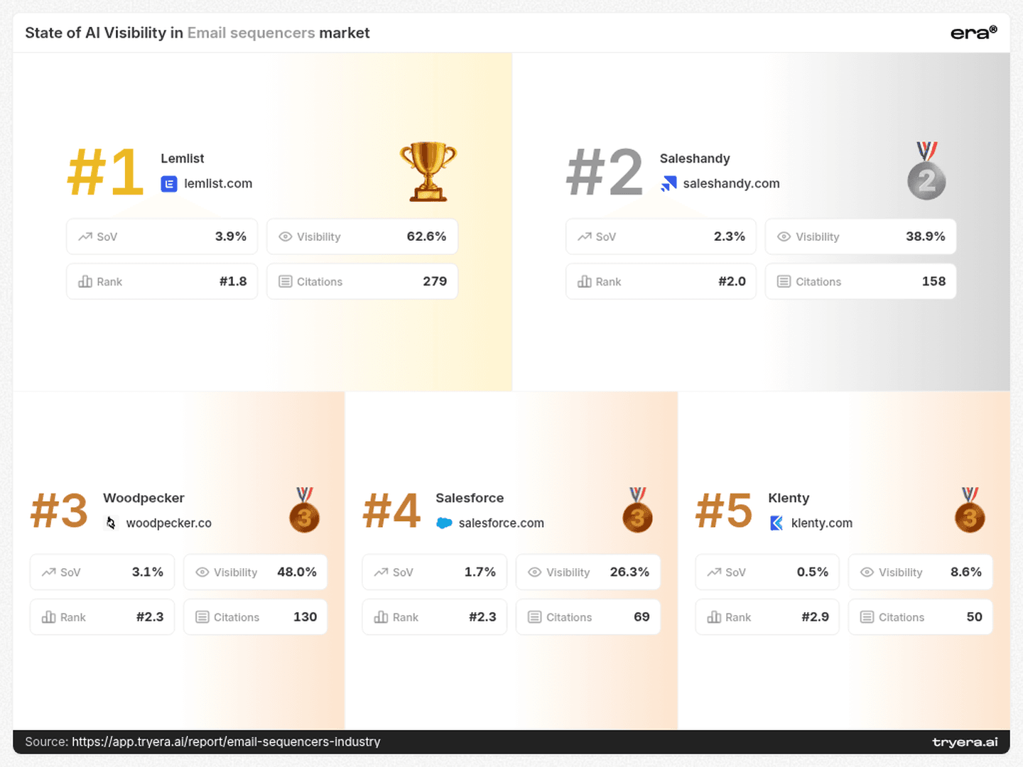
Lemlist occupies the first position on Era’s email sequencers podium. Outreach leads the Share of Voice chart. Woodpecker trails Lemlist in ChatGPT visibility but moves ahead in Google AI. Each result answers a different competitive question.
For an email sequencer, the useful objective is more specific than “win AI search”: enter the right shortlist, for the right buying task, on the engines where prospective customers actually look.
1. The leaderboard — separate reach, position, and share
Lemlist’s podium card combines 62.6% Visibility, an average Rank of 1.8, and 3.9% Share of Voice. These describe how often the brand appears, how early it appears, and its share of tracked brand mentions.
Even within the podium, ordering is not a simple visibility sort. Saleshandy occupies second place with 38.9% Visibility and a 2.0 average Rank. Woodpecker is third with 48.0% Visibility and a 2.3 average Rank. Woodpecker appears more often; Saleshandy appears earlier on average.
The Share of Voice chart presents another competitive set: Outreach leads at 14.4%, followed by Instantly at 11.5%, Apollo.io at 11.4%, Reply.io at 9.7%, and Smartlead at 9.5%. Together, those five account for 56.5% of the displayed Share of Voice.
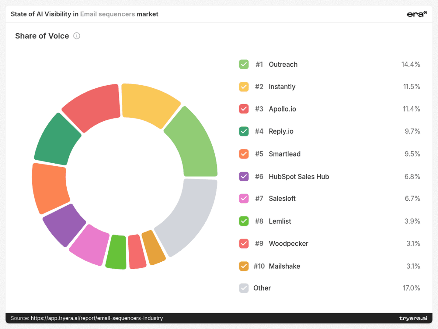
A team benchmarking only against the podium would miss several major participants in the tracked conversation. Build separate views for mention frequency, average position, and share. Use each to diagnose a different problem: exclusion from answers, late placement, or a limited share of attention.
A podium position, a frequent mention, and an early recommendation are different competitive outcomes.
2. Provider gaps — Woodpecker changes the comparison
Lemlist reaches 80.0% Visibility in ChatGPT, compared with 18.0% for Woodpecker. In Google AI, the ordering reverses: Woodpecker reaches 52.1%, versus 31.3% for Lemlist.
Woodpecker’s own visibility ranges from 18.0% in ChatGPT to 68.0% in Perplexity: a 50-percentage-point gap. A single average would conceal the difference between these two environments.
The contrasts extend beyond the podium. EmailBison reaches 16.0% in Claude and 0.0% in ChatGPT. Guideflow shows the opposite kind of gap, with 30.0% in Perplexity and 0.0% in Claude.
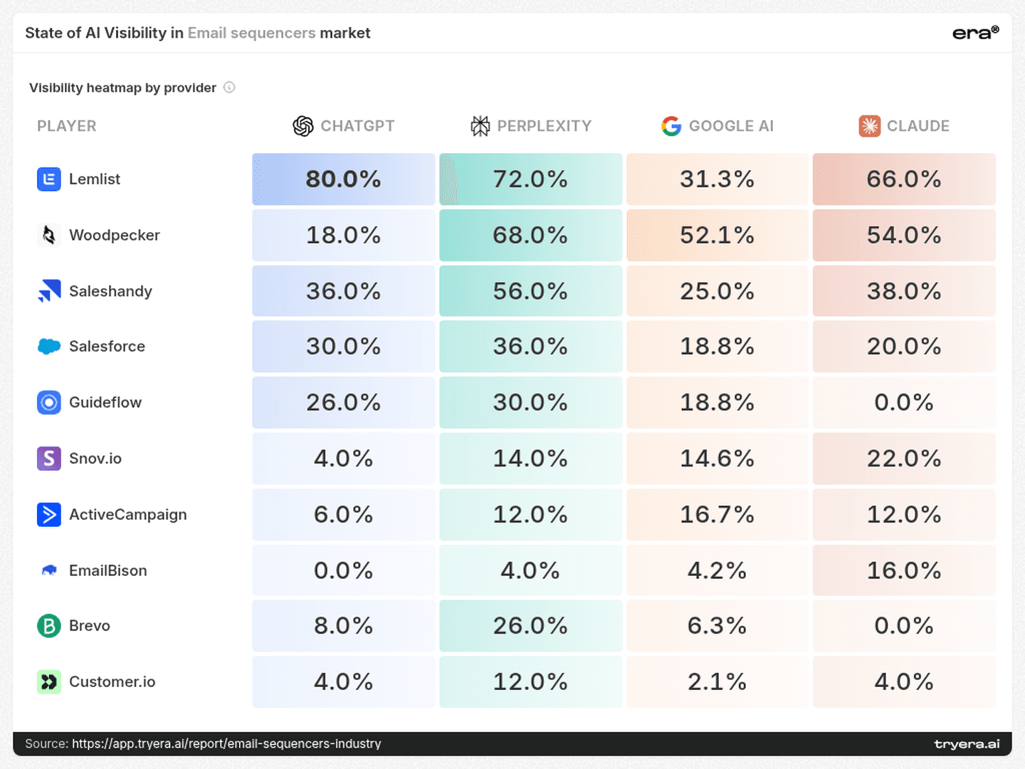
These are report-wide provider results. They identify where to investigate, rather than establishing which individual query produced the gap.
For Woodpecker, compare the answers and cited evidence behind the ChatGPT and Perplexity results. For EmailBison, investigate the contexts in which Claude includes the brand, then test those same buying questions across engines. For Guideflow, check whether the sales-engagement use cases associated with its presence elsewhere appear in Claude’s answers at all.
3. Beyond the podium — limited reach can coexist with early placement
EmailBison has 6.1% Visibility and an average Rank of 2.8. QuickMail reaches 8.6% Visibility with the same 2.8 average Rank. Guideflow appears more frequently, at 18.7% Visibility, but has a later 4.2 average Rank.
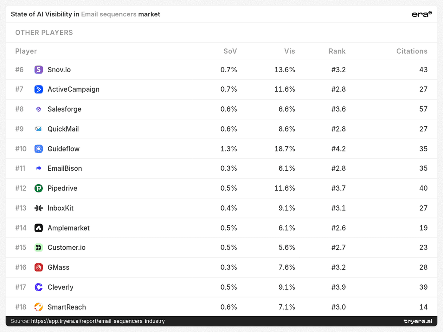
For EmailBison and QuickMail, the diagnosis is not simply “move up the list.” Their appearances are already relatively early on average. An equally relevant question is which suitable buying situations omit them entirely.
Guideflow suggests a different investigation: why does broader inclusion coexist with later placement? Examine whether answers describe it as a direct choice, a complementary tool, or an option for a narrower part of the workflow.
These are different content tasks. Expanding the range of relevant questions requires evidence for additional use cases. Improving placement within existing answers requires a clearer account of fit and differentiation. Track the two separately.
4. Buyer intent — uptime deserves a different answer from “best tool”
The top-query associations distinguish several buying situations:
Lemlist and Salesforce share “best email sequencer tools sales teams 2026.”
Woodpecker and Brevo share “best email sequencer tools small business 2026.”
Snov.io is associated with “best email sequencers lead generation 2026.”
EmailBison is associated with “email sequencing platforms uptime comparison 2026.”
Guideflow is associated with “best email sequencer tools 2026 sales engagement.”
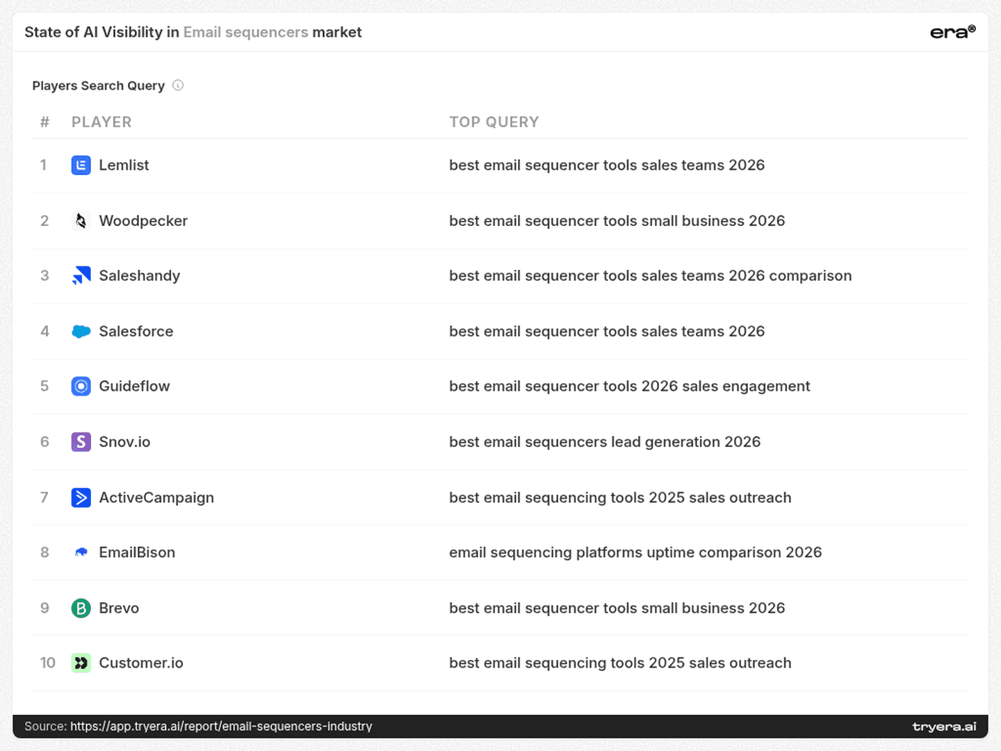
The EmailBison query is particularly useful. It asks for a reliability comparison, rather than a generic feature list. That suggests a concrete evidence check: can a buyer find dated availability records, incident history, recovery information, and clearly defined service commitments?
The small-business query calls for another kind of comparison: setup effort, ongoing administration, and costs under a realistic sending scenario. Lead-generation intent raises questions about the transition from finding a prospect to executing the sequence.
These query associations are starting points for investigation, not proof that a brand wins the query. Build a prompt set around the buying jobs they reveal, then compare like-for-like answers across providers.
The useful content brief begins with the buyer’s decision, not the category keyword.
5. Citation competition — suppliers also help frame the shortlist
The source-domain chart includes Instantly, Woodpecker, Saleshandy, Salesforge, and other commercial participants. Salesforge’s domain is fourth in that displayed source list, with a count of 76.
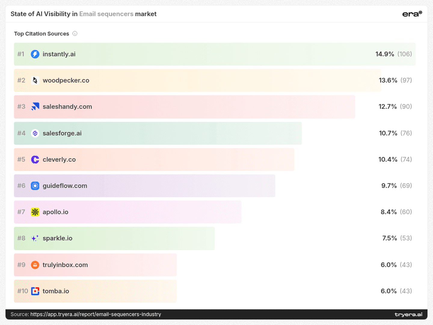
That is a distinct competitive role from Salesforge’s 6.6% brand Visibility in the other-players table. A company can participate as a source even when it is mentioned in a relatively small share of answers. Source presence and brand inclusion should therefore be audited separately.
At the page level, the leading displayed entry is a Sparkle comparison page, whose visible title begins “21 Best Email Sequence Tools Analyzed With Live Te...”, with a count of 54. The next entries include TrulyInbox at 40 and Tomba at 34. StackFYI’s “Outreach vs Salesloft vs Apollo 2026 | StackFYI” appears with 18.
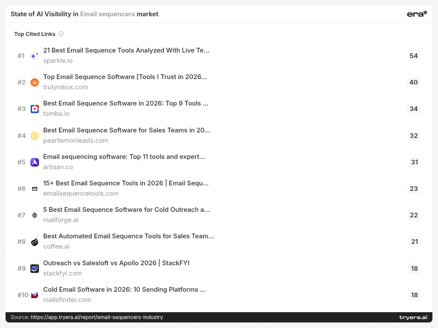
This is a practical research list. Inspect the selection criteria, product descriptions, and supporting evidence in the comparison pages buyers encounter through AI answers. Check whether your product is included, whether its capabilities are described accurately, and whether the comparison fits the intended buyer.
A vendor-authored comparison can be relevant evidence, but it should be distinguished from independent evaluation. The opportunity is to make accurate product information available wherever the category is being explained—not merely to publish another “best tools” list.
6. Citation mix — an owned-site project has a limited field of view
Lemlist’s citation mix is 34.9% own domain, 0.7% social, and 64.4% other sources. Woodpecker shows 35.1% own domain and 63.7% other sources. EmailBison has a larger owned share, 44.6%, while other sources still account for 55.4%.
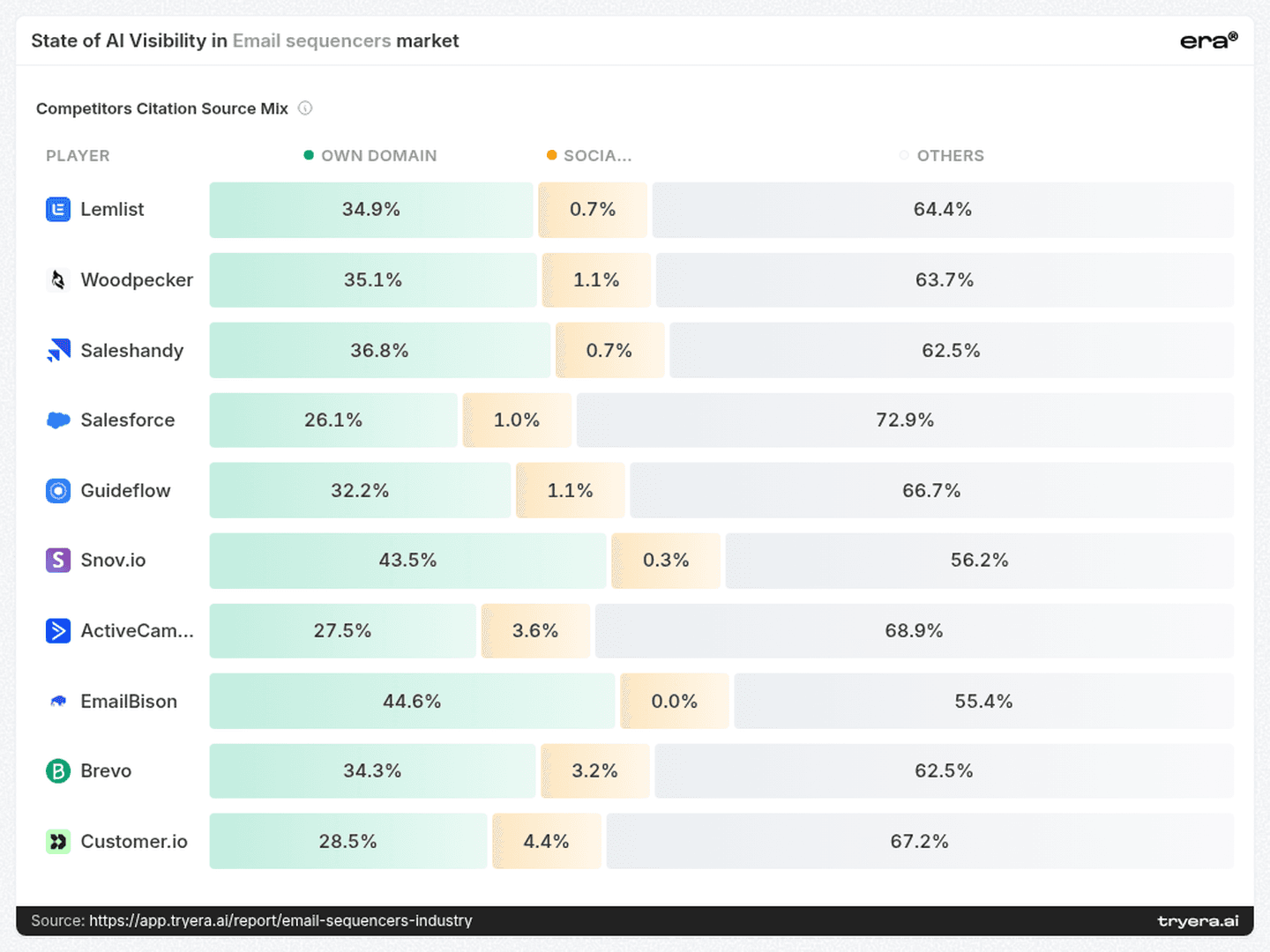
The “other sources” category should not be equated with independent endorsement: it can include commercially interested publishers. It nevertheless shows why a website-only review misses much of the evidence surrounding a brand.
Run two connected workstreams. On the owned site, make product limits, integrations, pricing assumptions, and relevant proof easy to find. Across external sources, check descriptions, outdated claims, and missing evidence for the buying situations that matter.
The output should be a list of specific information gaps and corrections, rather than a target number of articles to publish.
7. Technical work — fix observable problems and test the outcome
Era’s competitive-landscape page lists 320 common issues. The largest categories are 115 missing or invalid structured-data findings and 86 content-readability findings. It also records 26 crawler-access findings and 14 page-discovery findings.
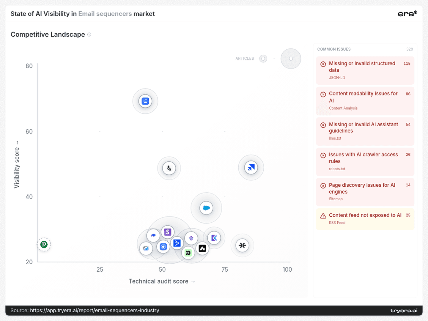
These findings support a technical investigation, not a causal explanation for the rankings.
Begin with the pages selected for the relevant buying intents. Check whether intended crawlers can access them, whether important information appears in readable page content, and whether discovery paths and structured data accurately reflect the page.
Then distinguish technical completion from visibility outcomes. A corrected access rule is a verified implementation result. More frequent inclusion in a repeated prompt set is a separate measured result. Keep both in the scorecard.
8. The next 90 days — run a focused shortlist experiment
Days 1–30: define the buying questions and establish the baseline.
Choose three relevant clusters from the report: for example, small-business sequencing, sales-team comparisons, and uptime. Write a fixed set of prompts for each. Run them across ChatGPT, Perplexity, Google AI, and Claude, recording brand inclusion, position, and cited pages.
Review the provider contrasts highlighted by Woodpecker, EmailBison, and Guideflow. Identify the prompts behind the differences before assigning content work.
Days 31–60: close specific evidence gaps.
Create or revise one substantive resource for each chosen cluster. An uptime resource should contain verifiable operating evidence; a small-business comparison should state its pricing and workload assumptions; a sales-team resource should explain workflow fit and relevant integrations.
Check the comparison pages identified in the citation research for inaccurate or incomplete descriptions. Validate access, discoverability, readability, and structured data on the owned pages you change.
Days 61–90: repeat the measurement and decide what to expand.
Rerun the same prompts, retaining results by provider and intent. Compare inclusion separately from average position. Inspect whether the revised pages are cited and whether external descriptions have changed.
Expand the work only where the evidence supports it. If a brand gains mentions but remains late in the answer, investigate differentiation. If position is strong but inclusion remains narrow, test additional relevant buying situations.
The goal is a clearer connection between a buyer’s question, the evidence available, and the shortlist that appears.
Want this scoreboard for your own brand? Run a free audit at tryera.ai/free-report — 30 minutes, your numbers, no deck required.
Full report with source data: Email sequencers.



An email sequencer can be relevant to a buyer and still be absent from the AI answer that shapes their shortlist. For teams competing on outbound workflows, that makes visibility a question of which buying situation—and which answer engine—recognizes the product. Era’s email sequencers report examines brand mentions, Share of Voice, position, provider visibility, citations, and technical signals. Read together, these measures reveal a market with several different leaders: appearing often, appearing early, and supplying the cited evidence are separate competitive outcomes.
The company on the podium is not necessarily the company taking the largest share of the conversation.
Lemlist occupies the first position on Era’s email sequencers podium. Outreach leads the Share of Voice chart. Woodpecker trails Lemlist in ChatGPT visibility but moves ahead in Google AI. Each result answers a different competitive question.
For an email sequencer, the useful objective is more specific than “win AI search”: enter the right shortlist, for the right buying task, on the engines where prospective customers actually look.
1. The leaderboard — separate reach, position, and share
Lemlist’s podium card combines 62.6% Visibility, an average Rank of 1.8, and 3.9% Share of Voice. These describe how often the brand appears, how early it appears, and its share of tracked brand mentions.
Even within the podium, ordering is not a simple visibility sort. Saleshandy occupies second place with 38.9% Visibility and a 2.0 average Rank. Woodpecker is third with 48.0% Visibility and a 2.3 average Rank. Woodpecker appears more often; Saleshandy appears earlier on average.
The Share of Voice chart presents another competitive set: Outreach leads at 14.4%, followed by Instantly at 11.5%, Apollo.io at 11.4%, Reply.io at 9.7%, and Smartlead at 9.5%. Together, those five account for 56.5% of the displayed Share of Voice.
A team benchmarking only against the podium would miss several major participants in the tracked conversation. Build separate views for mention frequency, average position, and share. Use each to diagnose a different problem: exclusion from answers, late placement, or a limited share of attention.
A podium position, a frequent mention, and an early recommendation are different competitive outcomes.
2. Provider gaps — Woodpecker changes the comparison
Lemlist reaches 80.0% Visibility in ChatGPT, compared with 18.0% for Woodpecker. In Google AI, the ordering reverses: Woodpecker reaches 52.1%, versus 31.3% for Lemlist.
Woodpecker’s own visibility ranges from 18.0% in ChatGPT to 68.0% in Perplexity: a 50-percentage-point gap. A single average would conceal the difference between these two environments.
The contrasts extend beyond the podium. EmailBison reaches 16.0% in Claude and 0.0% in ChatGPT. Guideflow shows the opposite kind of gap, with 30.0% in Perplexity and 0.0% in Claude.
These are report-wide provider results. They identify where to investigate, rather than establishing which individual query produced the gap.
For Woodpecker, compare the answers and cited evidence behind the ChatGPT and Perplexity results. For EmailBison, investigate the contexts in which Claude includes the brand, then test those same buying questions across engines. For Guideflow, check whether the sales-engagement use cases associated with its presence elsewhere appear in Claude’s answers at all.
3. Beyond the podium — limited reach can coexist with early placement
EmailBison has 6.1% Visibility and an average Rank of 2.8. QuickMail reaches 8.6% Visibility with the same 2.8 average Rank. Guideflow appears more frequently, at 18.7% Visibility, but has a later 4.2 average Rank.
For EmailBison and QuickMail, the diagnosis is not simply “move up the list.” Their appearances are already relatively early on average. An equally relevant question is which suitable buying situations omit them entirely.
Guideflow suggests a different investigation: why does broader inclusion coexist with later placement? Examine whether answers describe it as a direct choice, a complementary tool, or an option for a narrower part of the workflow.
These are different content tasks. Expanding the range of relevant questions requires evidence for additional use cases. Improving placement within existing answers requires a clearer account of fit and differentiation. Track the two separately.
4. Buyer intent — uptime deserves a different answer from “best tool”
The top-query associations distinguish several buying situations:
Lemlist and Salesforce share “best email sequencer tools sales teams 2026.”
Woodpecker and Brevo share “best email sequencer tools small business 2026.”
Snov.io is associated with “best email sequencers lead generation 2026.”
EmailBison is associated with “email sequencing platforms uptime comparison 2026.”
Guideflow is associated with “best email sequencer tools 2026 sales engagement.”
The EmailBison query is particularly useful. It asks for a reliability comparison, rather than a generic feature list. That suggests a concrete evidence check: can a buyer find dated availability records, incident history, recovery information, and clearly defined service commitments?
The small-business query calls for another kind of comparison: setup effort, ongoing administration, and costs under a realistic sending scenario. Lead-generation intent raises questions about the transition from finding a prospect to executing the sequence.
These query associations are starting points for investigation, not proof that a brand wins the query. Build a prompt set around the buying jobs they reveal, then compare like-for-like answers across providers.
The useful content brief begins with the buyer’s decision, not the category keyword.
5. Citation competition — suppliers also help frame the shortlist
The source-domain chart includes Instantly, Woodpecker, Saleshandy, Salesforge, and other commercial participants. Salesforge’s domain is fourth in that displayed source list, with a count of 76.
That is a distinct competitive role from Salesforge’s 6.6% brand Visibility in the other-players table. A company can participate as a source even when it is mentioned in a relatively small share of answers. Source presence and brand inclusion should therefore be audited separately.
At the page level, the leading displayed entry is a Sparkle comparison page, whose visible title begins “21 Best Email Sequence Tools Analyzed With Live Te...”, with a count of 54. The next entries include TrulyInbox at 40 and Tomba at 34. StackFYI’s “Outreach vs Salesloft vs Apollo 2026 | StackFYI” appears with 18.
This is a practical research list. Inspect the selection criteria, product descriptions, and supporting evidence in the comparison pages buyers encounter through AI answers. Check whether your product is included, whether its capabilities are described accurately, and whether the comparison fits the intended buyer.
A vendor-authored comparison can be relevant evidence, but it should be distinguished from independent evaluation. The opportunity is to make accurate product information available wherever the category is being explained—not merely to publish another “best tools” list.
6. Citation mix — an owned-site project has a limited field of view
Lemlist’s citation mix is 34.9% own domain, 0.7% social, and 64.4% other sources. Woodpecker shows 35.1% own domain and 63.7% other sources. EmailBison has a larger owned share, 44.6%, while other sources still account for 55.4%.
The “other sources” category should not be equated with independent endorsement: it can include commercially interested publishers. It nevertheless shows why a website-only review misses much of the evidence surrounding a brand.
Run two connected workstreams. On the owned site, make product limits, integrations, pricing assumptions, and relevant proof easy to find. Across external sources, check descriptions, outdated claims, and missing evidence for the buying situations that matter.
The output should be a list of specific information gaps and corrections, rather than a target number of articles to publish.
7. Technical work — fix observable problems and test the outcome
Era’s competitive-landscape page lists 320 common issues. The largest categories are 115 missing or invalid structured-data findings and 86 content-readability findings. It also records 26 crawler-access findings and 14 page-discovery findings.
These findings support a technical investigation, not a causal explanation for the rankings.
Begin with the pages selected for the relevant buying intents. Check whether intended crawlers can access them, whether important information appears in readable page content, and whether discovery paths and structured data accurately reflect the page.
Then distinguish technical completion from visibility outcomes. A corrected access rule is a verified implementation result. More frequent inclusion in a repeated prompt set is a separate measured result. Keep both in the scorecard.
8. The next 90 days — run a focused shortlist experiment
Days 1–30: define the buying questions and establish the baseline.
Choose three relevant clusters from the report: for example, small-business sequencing, sales-team comparisons, and uptime. Write a fixed set of prompts for each. Run them across ChatGPT, Perplexity, Google AI, and Claude, recording brand inclusion, position, and cited pages.
Review the provider contrasts highlighted by Woodpecker, EmailBison, and Guideflow. Identify the prompts behind the differences before assigning content work.
Days 31–60: close specific evidence gaps.
Create or revise one substantive resource for each chosen cluster. An uptime resource should contain verifiable operating evidence; a small-business comparison should state its pricing and workload assumptions; a sales-team resource should explain workflow fit and relevant integrations.
Check the comparison pages identified in the citation research for inaccurate or incomplete descriptions. Validate access, discoverability, readability, and structured data on the owned pages you change.
Days 61–90: repeat the measurement and decide what to expand.
Rerun the same prompts, retaining results by provider and intent. Compare inclusion separately from average position. Inspect whether the revised pages are cited and whether external descriptions have changed.
Expand the work only where the evidence supports it. If a brand gains mentions but remains late in the answer, investigate differentiation. If position is strong but inclusion remains narrow, test additional relevant buying situations.
The goal is a clearer connection between a buyer’s question, the evidence available, and the shortlist that appears.
Want this scoreboard for your own brand? Run a free audit at tryera.ai/free-report — 30 minutes, your numbers, no deck required.
Full report with source data: Email sequencers.